Forecast sensitivity analysis tests how much a single assumption, such as win rate or average deal size, moves your final revenue forecast when you flex it up or down while holding everything else fixed. The immediate action for any analyst is straightforward: identify your two or three most measurable pipeline drivers, run each one independently against a documented baseline, and insist that those baseline inputs are traceable back to CRM records rather than gut feel. Skip that discipline and you are guessing with extra steps.
TL;DR:
- Focus on measuring the impact of two to three key pipeline drivers, such as win rate or deal size, using traceable CRM data.
- Flex each driver within realistic historical ranges and record forecast changes to accurately rank their influence on revenue predictions.
- Avoid changing multiple inputs simultaneously in sensitivity tests, unless interactions are suspected, to prevent misleading results.
- Ensure the baseline data is traceable, perturbation ranges are realistic, and drivers are independent to maintain the analysis’s credibility.
- Use sensitivity analysis results to establish monitoring thresholds and trigger alerts based on the drivers with the largest forecast impact.
Table of Contents
- What forecast sensitivity analysis is (and what it is not)
- How to run a one-way sensitivity test this week
- Reading the results: from tornado chart to monitoring plan
- Where sensitivity analysis goes wrong
- Why deterministic inputs make sensitivity testing defensible
- What I’d demand before trusting a sensitivity analysis
- How a revenue intelligence platform turns sensitivity findings into a defensible forecast
- Sources
- FAQ
What forecast sensitivity analysis is (and what it is not)
Sensitivity analysis isolates one input variable, such as your win rate or average deal size, and measures its specific effect on the forecast while holding every other variable at baseline. That is the definition used by the Scottish Fiscal Commission, and it is the working definition every forecasting team should adopt. The method is often called one-way, or OAT (one-at-a-time), because you change one thing, record the outcome, put it back, and move to the next variable.
The practical steps are simple:
- Set a baseline forecast using current pipeline data.
- Flex one driver, say win rate, up and down by a defined percentage.
- Record the change in the dependent variable, your revenue forecast.
- Repeat for each driver, then rank them by size of impact, typically in a tornado chart, where the widest bar sits at the top.
Pro Tip: A tornado chart only works if every bar starts from the same baseline. If you flex win rate off last quarter’s number and deal size off this quarter’s, your ranking is meaningless.
Scenario analysis is a different exercise entirely. Where sensitivity analysis asks “what happens if this one thing moves”, scenario analysis asks “what happens under this coherent combination of moves”, changing several inputs together to model a best case, worst case, and base case. The Corporate Finance Institute draws this distinction clearly, and Control Horizon frames it as local elasticity versus joint governance planning. Confusing the two is the single most common error we see in forecast decks.
How to run a one-way sensitivity test this week
You don’t need modelling software to do this properly. You need a clean baseline, a handful of measurable drivers, and the discipline to change one variable at a time.
- Build your driver model. Pick drivers with a direct line to CRM fields: win rate, average deal size, sales cycle length, stage conversion rate. Avoid vague inputs like “market sentiment” that nobody can trace back to a record.
- Set your baseline. Use trailing pipeline data, typically the last two to four quarters, and document exactly where each number came from.
- Choose perturbation ranges. Flex each driver by a realistic amount based on historical variance rather than a round number picked for convenience. Write down why you chose that range.
- Run the test. Change one driver, hold the rest fixed, recalculate the forecast, and log the result. In Excel, a simple data table (Data > What-If Analysis > Data Table) does this in minutes once your formula references the baseline cell. Practitioner guides from CFI walk through the exact cell setup.
- Rank and chart. Sort drivers by the size of their swing and plot them as a tornado chart, widest impact on top.
- Escalate if needed. If two drivers interact, for instance deal size and cycle length moving together, a one-way test will mislead you. That is when ensemble-based or Sobol-style multi-way methods, used in meteorological forecasting, become worth the extra effort.
Most quarterly forecasts never need step six. Start with one-way testing on your top three drivers and only add complexity when the data demands it.
Reading the results: from tornado chart to monitoring plan
A tornado chart tells you two things: which driver moves the forecast most, and in which direction. A driver with a wide bar and high commercial volatility, such as average deal size in a lumpy enterprise pipeline, deserves a monitoring threshold. A driver with a narrow bar can usually be tracked less frequently.
Once you know your top drivers, convert that ranking into governance actions:
- Set a trigger: if win rate drops more than a defined amount below baseline, flag the forecast for review before it reaches the board.
- Prioritise data collection on the assumptions with the widest bars first. This mirrors advice from UCAR/DART research, which uses sensitivity analysis to decide where extra observations reduce forecast error most.
- Feed your ranked drivers into scenario design. Sensitivity tells you what to vary in a scenario; scenario analysis tells you what happens when those variables move together, a complementary pairing Control Horizon also recommends.
| Sensitivity finding | Governance action |
|---|---|
| Win rate swing moves forecast by the largest margin | Set a stage-conversion alert tied to CRM data |
| Deal size swing is moderate | Review monthly, not weekly |
| Cycle length swing is narrow | Track quarterly, low monitoring priority |
The point of this exercise is not the chart. It is the decision the chart forces: which assumption gets watched closely, and which one you can safely leave alone.
Where sensitivity analysis goes wrong
The most common mistake is treating a sensitivity output as if it were a scenario forecast, presenting “win rate up 10%” as a business plan rather than a diagnostic. It answers a narrower question: how much does this one lever matter, in isolation.
A second failure is picking perturbation ranges that flatter the story you want to tell. Flexing a driver by 50% when its historical variance is 8% produces a dramatic tornado bar and a meaningless conclusion.
Third, one-way testing ignores interactions by design. If win rate and deal size move together in your actual pipeline, testing them separately hides that relationship, which is exactly why ensemble-based methods exist for more complex forecasting problems.
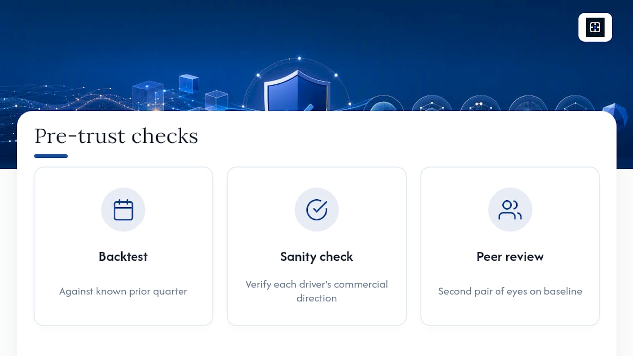
Before you trust any output, run three checks: backtest the model against a prior quarter you already know the outcome of, sanity check that the direction of each driver’s effect makes commercial sense, and get a second set of eyes on the baseline before it reaches a board pack.
Why deterministic inputs make sensitivity testing defensible
Sensitivity analysis is only as trustworthy as the baseline you built it on. If your win rate figure came from a spreadsheet a rep updated manually last Tuesday, your entire tornado chart is built on sand.
A deterministic approach fixes that problem at the source. Every driver traces to a specific Salesforce field. Every perturbation is logged against a recorded baseline, not a remembered one. The workflow looks like this:
- Driver (win rate) links to a CRM field (opportunity stage history).
- That field links to an evidence item (the actual stage change date and owner).
- Any perturbation you test is recorded against that traceable baseline, not an assumption.
This matters most in three situations: a leadership transition, where a new VP inherits a forecast nobody can explain; a forecast reset after a miss; and board defence, where “trust me” is not an acceptable answer to “why is this number right.” Commitcontrol’s approach to leadership transitions was built around exactly this gap: rebuilding forecast confidence from CRM-traceable evidence rather than a new leader’s opinion.
What I’d demand before trusting a sensitivity analysis
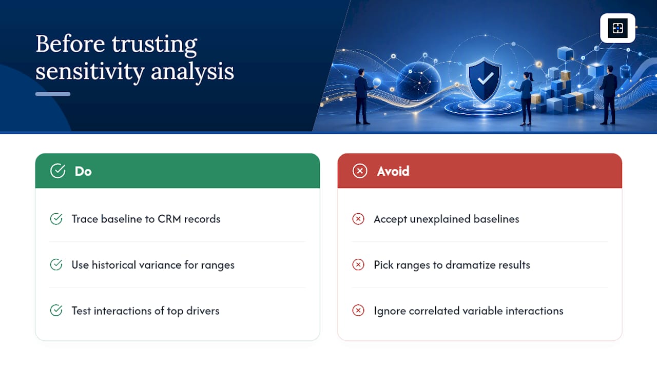
If someone hands you a sensitivity analysis in a forecast pack, ask three questions before you accept the conclusion. First: where did the baseline come from, and can you trace every number back to a CRM record? Second: were the perturbation ranges chosen from historical variance, or picked to make the chart look dramatic? Third: did anyone check for interactions between the top two drivers, or was this a pure one-way test on a pipeline where variables clearly move together?
Most forecast packs fail at least one of these questions. That is not a reason to distrust the technique. It is a reason to demand better inputs before you let the technique drive a board conversation.
— Brian
How a revenue intelligence platform turns sensitivity findings into a defensible forecast
Most forecasting tools ask you to trust a score without showing the reasoning behind it. A deterministic revenue intelligence platform ensures every deal score ties back to specific, traceable Salesforce signals, so when a driver like win rate or deal size shifts, you can see exactly why the number moved and defend that reasoning in the boardroom.
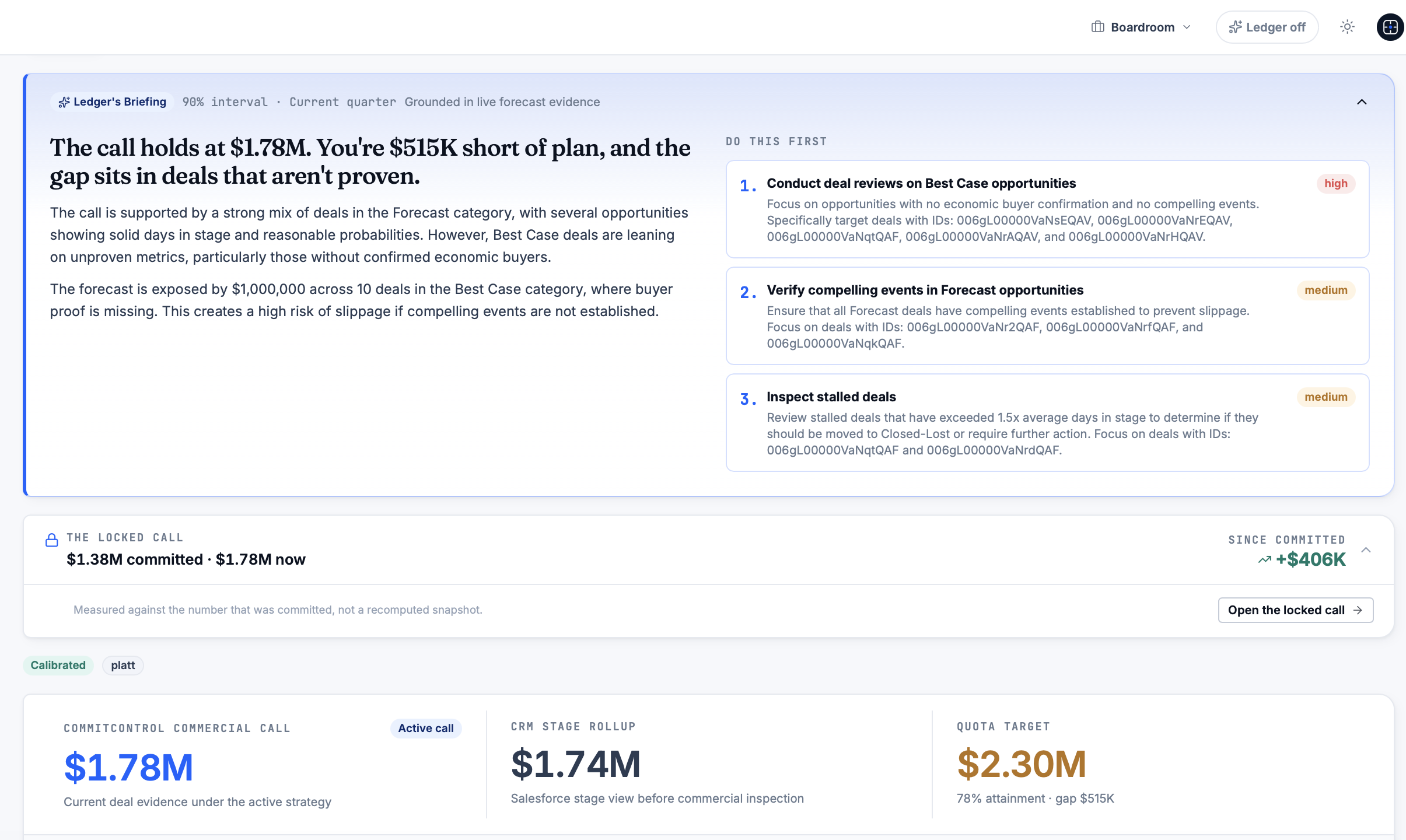
That matters directly for sensitivity work. Instead of building perturbation ranges on a spreadsheet estimate, drivers can be flexed against evidence trails tied to CRM fields, making the baseline, the ranges, and ranked drivers auditable by anyone who asks. This is not a black-box scoring model bolted onto your pipeline. It is a deterministic system: the same inputs always produce the same score, and a human owns every judgement call the system makes. If you want to see what a forecast miss actually costs before you invest in fixing it, the Sales Forecast Miss ROI Calculator gives you that number in minutes. For a fuller look at how the platform structures evidence and scoring, visit Commitcontrol.
Sources
- Forecast sensitivity analysis | Scottish Fiscal Commission
- Scenario analysis vs sensitivity analysis · Corporate Finance Institute
- Ensemble-Based Sensitivity Analysis · Torn & Hakim (2008)
FAQ
What are the three types of sensitivity analysis?
Practitioners generally distinguish one-way (or OAT) analysis, which flexes a single variable; multi-way analysis, which flexes several variables in combination; and ensemble or probabilistic methods, which model many combinations at once to capture interactions. The Corporate Finance Institute covers the first two in most practitioner training.
How do I perform a sensitivity analysis?
Set a documented baseline, flex one driver at a time by a realistic range, record the change in your forecast, then rank drivers by the size of their impact, typically in a tornado chart. Escalate to multi-way testing only when you suspect two drivers interact.
Can Excel do sensitivity analysis?
Yes. Excel’s Data Table function under What-If Analysis lets you flex one or two inputs against a formula and see the resulting outputs instantly, which is how most practitioner tutorials, including CFI’s, demonstrate the technique.
How do you interpret sensitivity analysis results?
A wider bar on a tornado chart means that driver has more influence over your forecast, and its direction tells you whether increasing it helps or hurts the outcome. High-impact drivers deserve tighter monitoring thresholds and CRM-traceable evidence; low-impact ones can be reviewed less frequently.
What does Commitcontrol cost?
Current pricing is listed on the Commitcontrol pricing page rather than a fixed per-seat rate, since plans are structured around organisational scope.
Recommended
Editorial content. All metrics are Salesforce-derived and reviewed for accuracy. Not a substitute for professional judgment.
See the same discipline applied to your pipeline.
CommitControl derives every figure from your own Salesforce data. Nothing is invented, and every number traces back to the record it came from. Connect Salesforce and the same view runs live on your data within 24 hours.
Evaluate CommitControl